2013 MLB Wins Visualized

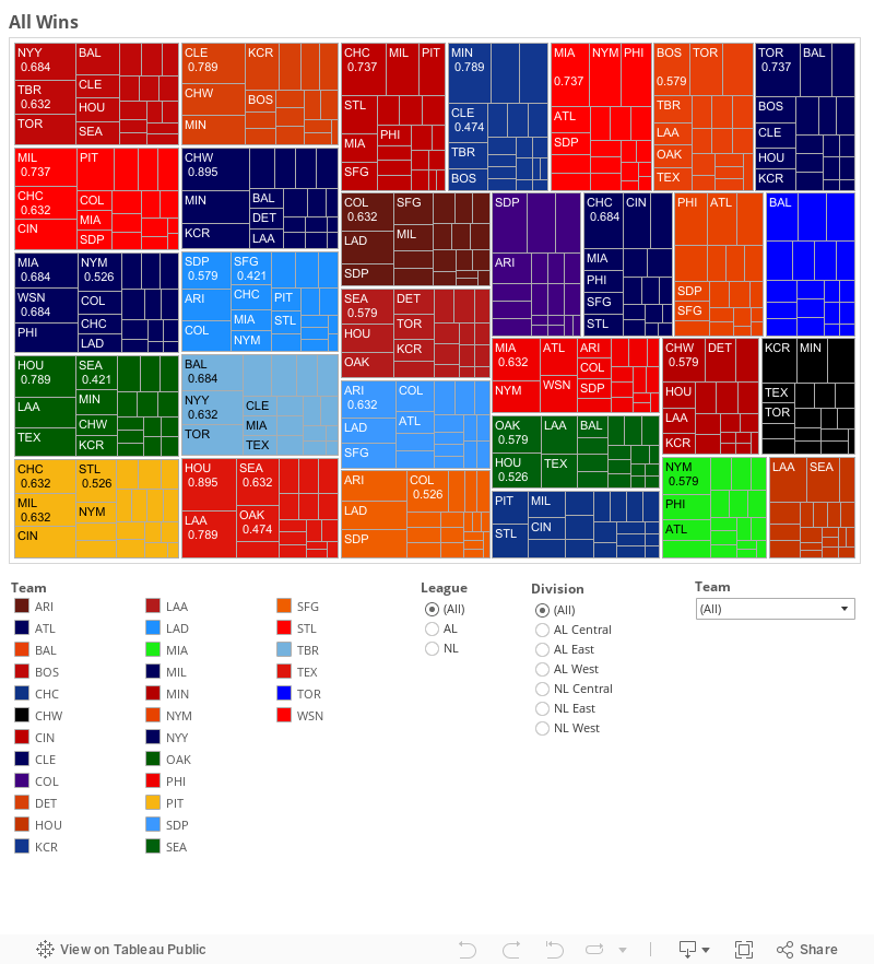
Want to know where all the wins in MLB came from last year? This chart tells you all 2431 (30 teams x 82 wins + 1 Gm163) wins came from last season. The chart is fully interactive. I do advise using a large screen since the chart is so large.
This is called a tree map, and the area each cell or group of cells represents wins. To understand this, the teams with the most wins have the largest area. And then they are sorted left to right and then top to bottom, so Boston is in the top left while Houston is in the bottom right. The teams as grouped by their team color. Then there are sub-cells which denote the wins against specific opponents. Those sub-cells are sized by wins. So if you look at the first sub-cell in Boston’s group you’ll see the NYY. This is because the Red Sox got the most wins against the Yankees. You’ll find that division foes usually have the most wins since they play each other the most. The winning percentage against that opponent is also listed in the cell, this is so you can evaluate how well the team actually did against that opponent. Did they win more or lose more? The answer will be determined by if the number is below .500 or above .500.