Do MLB Playoff Odds Work?
One of the more fan-accessible advanced stats are playoff odds [technically postseason probabilities]. Playoff odds range from 0% – 100% telling the fan the probability that a certain team will reach the MLB postseason. These are determined by creating a Monte Carlo simulation which runs the baseball season thousands of times [FanGraph runs theirs 10,000 times]. In those simulations, if a team reaches the postseason 5,000 times, then the team is predicted to have a 50% probability for making the postseason. FanGraphs and Baseball Prospectus run these every day, so playoff odds can be collected every day and show the story of a team’s season if they are graphed.

Above is a composite graph of the three different types of teams. The Dodgers were identified as a good team early in the season and their playoff odds stayed high because of consistently good play. The Brewers started their season off strong but had two steep drop offs in early July and early September. Even though the Brewers had more wins than the Dodgers, the FanGraphs playoff odds never valued the Brewers more than the Dodgers. The Royals started slow and had a strong finish to secure themselves their first postseason birth since 1985. All these seasons are different and their stories are captured by the graph. Generally, this is how fans will remember their team’s season — by the storyline.
Since the playoff odds change every day and become either 100% or 0% by the end of the season, the projections need to be compared to the actual results at the end of the season. The interpretation of having a playoff probability of 85% means that 85% of the time teams with the given parameters will make the postseason.
I gathered the entire 2014 season playoff odds from FanGraphs, put their predictions in buckets containing 10% increments of playoff probability. The bucket containing all the predictions for 20% bucket means that 20% of all the predictions in that bucket will go on to postseason. This can be applied to all the buckets 0%, 10%, 20%, etc.

Above is a chart comparing the buckets to the actual results. Since this is only using one year of data and only 10 teams made the playoffs, the results don’t quite match up to the buckets. The desired pattern is encouraging, but I would insist on looking at multiple years before making any real conclusions. The results for any given year is subject to the ‘stories’ of the 30 teams that play that season. For example, the 2014 season did have a team like the 2011 Red Sox, who failed to make the postseason after having a > 95% playoff probability. This is colloquially considered an epic ‘collapse’, but the 95% probability prediction not only implies there’s chance the team might fail, but it PREDICTS that 5% of the teams will fail. So there would be nothing wrong with the playoff odds model if ‘collapses’ like the Red Sox only happened once in a while.
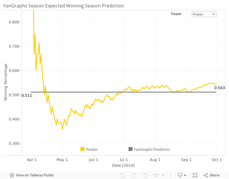
The playoff probability model relies on an expected winning percentage. Unlike a binary variable like making the postseason, a winning percentage has a more continuous quality to the data, so this will make the evaluation of the model easier. For the most part most teams do a good job staying around the initial predicted winning percentage coming really close to the prediction by the end of the season. Not every prediction is correct, but if there are enough good predictions the predictive model is useful. Teams also aren’t static, so bad teams can become worse by trading away players at the trade deadline or improve by acquiring those good players who were traded. There are also factors like injuries or player improvement, that the prediction system can’t account for because they are unpredictable by definition. The following line graph allows you to pick a team and check to see how they did relative to the predicted winning percentage. Some teams are spot on, but there are a few like the Orioles or Red Sox which are really far off.

The residual distribution [the actual values – the predicted values] should be a normal distribution centered around 0 wins. The following graph shows the residual distribution in numbers of wins, the teams in the middle had their actual results close to the predicted values. The values on the edges of the distribution are more extreme deviations. You would expect that improved teams would balance out the teams that got worse. However, the graph is skewed toward the teams that become much worse implying that there would be some mechanism that makes bad teams lose more often. This is where attitude, trades, and changes in strategy would come into play. I’d would go so far to say this is evidence that soft skills of a team like chemistry break down.

Since I don’t have access to more years of FanGraphs projections or other projection systems, I can’t do a full evaluation of the team projections. More years of playoff odds should yield probability buckets that reflect the expectation much better than a single year. This would allow for more than 10 different paths to the postseason to be present in the data. In the absence of this, I would say the playoff odds and predicted win expectancy are on the right track and a good predictor of how a team will perform.